Exploring Equality
Visualizing the relationship between gender inequality and income inequality
The UNDP has stated the following in the book Income Inequality in Sub-Saharan Africa:
This project aims to explore both (i) and (iii) by visualizing the relationship between gender inequality and income inequality in Africa. The metrics used to construct this data visualization include a breakdown of the Gender Inequality Index and the Gini coefficient. More information, including context, code, and sources can be found here.
The September 2015 adoption of the 2030 Agenda for Sustainable Development and its 17 Sustainable
Development Goals (SDGs) has drawn considerable attention to income inequality in sub-Saharan
Africa (SSA). To achieve the goal of "leaving no one behind" by 2030, the UNDP Regional Bureau
for Africa feels very strongly that inequality levels, trends, determinants and consequences in
the region must be documented properly.
The basic structural drivers of inequality can be divided into three groups:
(i) the highly dualistic economic structure, with limited employment of the labour elite in the government, multinational companies (MNCs) and the resource sector, whereas the majority of labour earns much lower incomes in the informal or subsistence sector;
(ii) the high concentration of physical capital, human capital and land, especially in the economies of East and Southern Africa, in certain groups or regions;
and (iii) the limited distributive capacity of the state, which often manifests in the "natural resource curse", the urban bias of public policy and ethnic and gender inequalities.
This project aims to explore both (i) and (iii) by visualizing the relationship between gender inequality and income inequality in Africa. The metrics used to construct this data visualization include a breakdown of the Gender Inequality Index and the Gini coefficient. More information, including context, code, and sources can be found here.
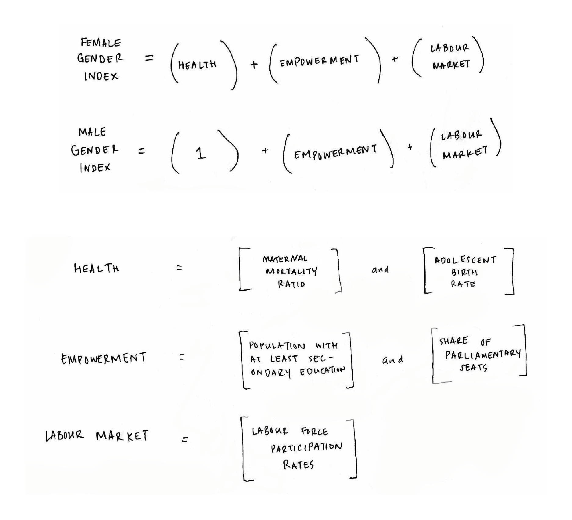
What is the GII?
The Gender Inequality Index (GII) measures gender inequalities
in three important aspects of human development-reproductive health,
measured by maternal mortality ratio and adolescent birth rates; empowerment,
measured by proportion of parliamentary seats occupied by females and proportion
of adult females and males aged 25 years and older with at least some secondary
education; and economic status, expressed as labour market participation and
measured by labour force participation rate of female and male populations
aged 15 years and older. A value of 0 represents perfect equality, while an
index of 100 implies perfect inequality.
What is the Gini Coefficient?
As stated by the World Bank, the Gini index measures the extent to which the
distribution of income among individuals or households deviates from a perfectly
equal distribution. A Lorenz curve plots the cumulative percentages of total
income received against the cumulative number of recipients, starting with the
poorest individual or household. The Gini index measures the area between the
Lorenz curve and a hypothetical line of absolute equality, expressed as a
percentage of the maximum area under the line. Similar to GII, a value of 0
represents perfect equality, while an index of 100 implies perfect inequality.
Understanding this Visualization
In the text Income Inequality Trends in Sub-Saharan Africa, we learn that as the economic status of women improves, so does the economic status of entire families. This visualization intends to show clear relationships between gender and income inequality, as well as educate the user on the calculation of male and female indexes. By understanding the impact of gender equality on income equality, and the difference in male and female indexes, we can work to raise female indexes, thus lowering gender and income inequality.
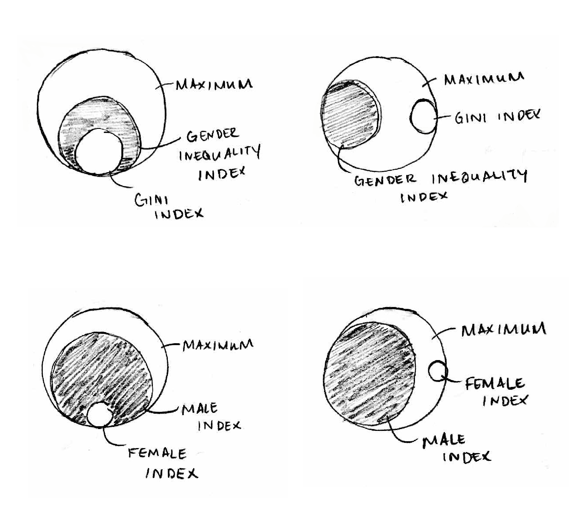
This visualization includes a comparison of GII and GINI as well as male and female indexes. As stated above, male and female indexes are used to calculate the GII. The circles are placed on top of a grey outline. The black circle represents the GII value, while the red circle represents the GINI value. In the related view, the black circle represents the male index, and the red circle indicates the female index.
To begin, select a view of "Comparing Gender and Income Inequality" or "Comparing Male and Female Indexes". The small multiples will appear below, and the Sort buttons are available to rearrange the data. Rollover the data for more information and to see each result separately. Click on the data to learn more about some of the data involved in the calculation of the gender inequality index. The color of the gini represents very high (blue), high (yellow), medium (orange), or low (red) human development.
What is the relationship between gender inequality and income inequality?